The role of wireframes, UI, and prototypes in successful B2B website projects
22nd November 2024 •
22nd November 2024 •

When designing websites, apps, digital products, and services, we throw around a whole bunch of terminology. Some of these terms are better understood than others. We might be asked to create some wireframes when what you’re really after is user interface (UI) design, or a prototype. This article gives a brief overview of the differences between these three common terms used during the design phase of a UX project.

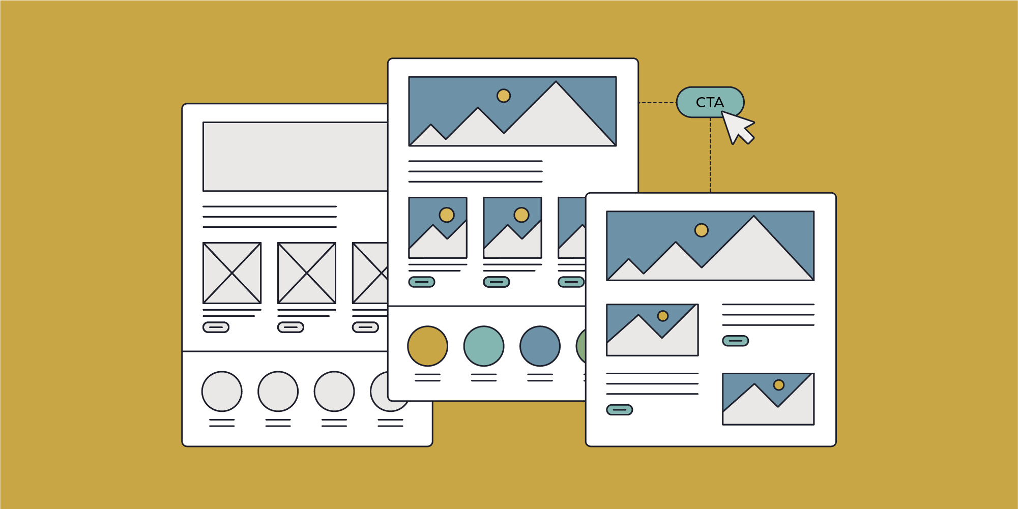
Wireframes are low-fidelity, simple blueprints that outline the basic structure of a web page or application. The focus is on placement of elements, information hierarchy, and functionality without detailed design.
They are used to plan the structure of the interface and to understand the user’s journey. We use wireframes as a way of communicating our vision and intent to stakeholders.
Wireframes are not the exclusive domain of UX designers. In fact, the term originates from when designers would use metal wire to create 3D models of their two-dimensional drawings. Web design wireframes are not 3D, but they are similar to the original concept of doing something low-cost, low-fidelity to help visualise and understand the underlying structure and shape.
Website wireframes are usually created in Figma nowadays, but any sketching tool will do. In fact, it’s quite acceptable to do them by hand. The low barrier to entry means anybody can get involved. It can be a fun and rewarding exercise for clients to sketch out their ideas too.
Wireframes are not an end in themselves but a means to move a project forward, making sure that key user journeys are considered before we start putting the gloss and sheen on something. We’ll often use the wireframes to sense-check ideas and concepts with users before getting into the more expensive production phase.
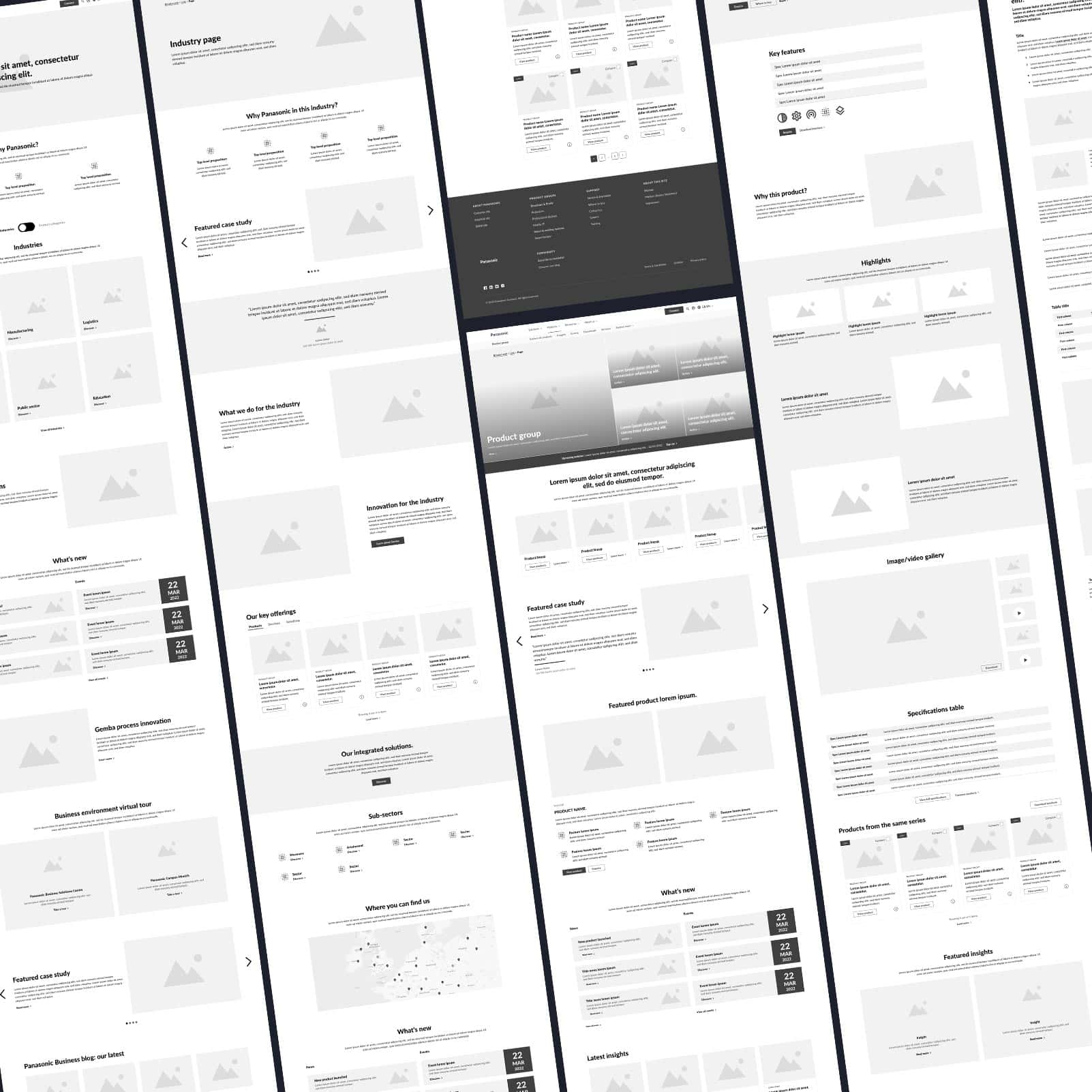
Right: A recent wireframe we created to help a client better understand the layout and content structure of their new intranet.
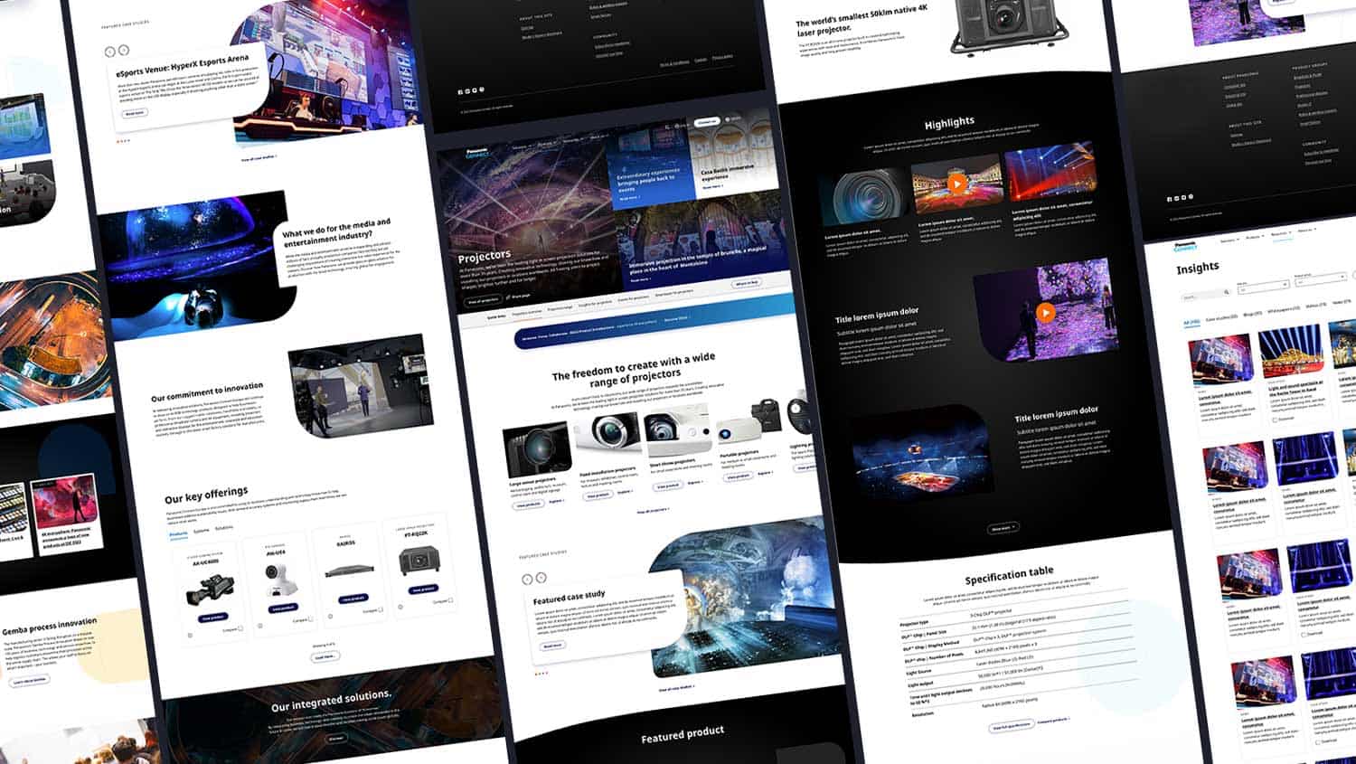
Where wireframes help give people a sense of the layout and information hierarchy, user interface (UI) design brings colour, typography, imagery, icons, forms, and buttons.
This will often be informed by existing brand guidelines as well as fresh user research and mood boards aiming to elicit a specific emotional response from users. UI is high-fidelity and indicative of the final visual experience that will go into production. Design is a skilled creative discipline and UI designers craft experiences that are responsive and accessible to all – while also adhering to corporate guidelines and global standards.
UI is typically formed using Figma or Sketch, the main tools specifically developed for designing websites and applications. Designers may also use Photoshop and Illustrator for specialist tasks as well as legacy apps like Adobe XD, depending on a client’s workflows and preferences.
The terms UI and UX (user experience) are often used together. UI is all about the look and feel. The surface level experience. UX informs the overall experience. Something might look great but if it doesn’t help the end user do what they need to do, the effort is wasted. Jumping straight into UI design without fully appreciating the end user, their goals, needs and expectations will inevitably lead to negative feedback.

Prototypes are interactive models of a design that simulate the user interaction of the final website or app. They take the wireframes of UI a step further by linking up pages and bringing to life experiences. This is a great way to give people a sense of the final product. Prototypes are often used in concept testing to validate an idea as well as in usability testing to iron out any kinks before entering an expensive build phase. They are often built in Figma, before moving into front-end code.
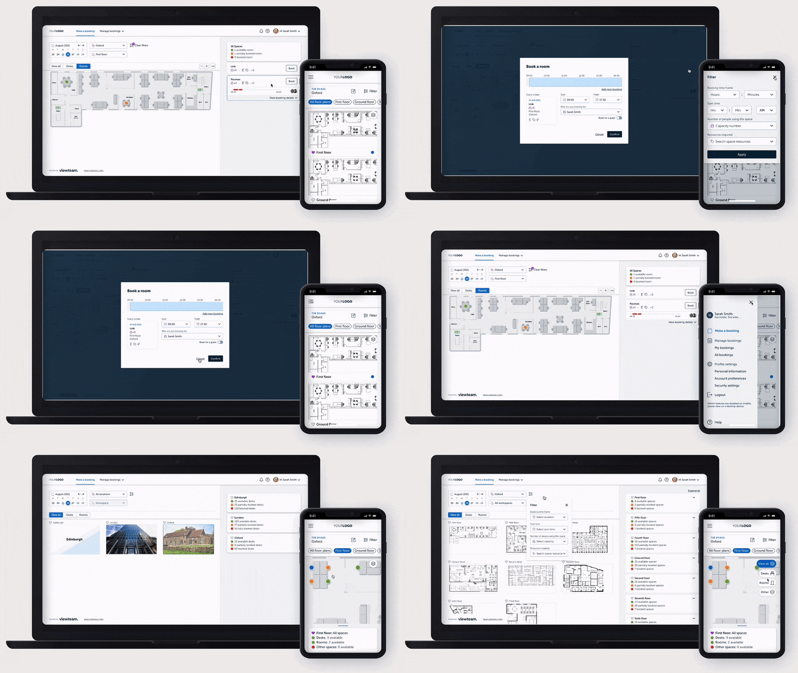
Below: A website prototype built in Figma helping the customer get a feel for the interactions we’d be looking to build.

Whilst the terms wireframes and UI are often used interchangeably, they are very different things. Our UX/UI designers will always ask a few questions to determine what our clients really need. If it’s some early-stage content prioritisation in a lo-fi design we’re looking at wireframes. If it’s a high-gloss, polished design, we’re in the realms of UI. If clients are wanting to click around and get a sense of what it’s like to move from one page or state to another, then it’s a prototype.
In short, wireframes serve as a design intent for what people should do on their journey to achieve their goals. UI enhances their experience by adding colour, texture and other elements to help stimulate the user. Prototypes help us test if people can and will do as the designer intended.
| Barrier to entry | Fidelity | Purpose | |
| Wireframe | Low | Low | Communicate page structure. |
| User Interface Design (UI) | High | High | Communicate look and feel. |
| Prototype | Medium | Variable | Communicate user journey across several pages. |
A wireframe is a low-fidelity blueprint that outlines the basic structure of a web page or application. It focuses on the placement of elements, information hierarchy, and functionality without detailed design.
Wireframes help plan the structure of the interface and understand the user’s journey. They are used to communicate design intent to stakeholders and validate ideas before entering the production phase.
Yes, wireframes can be created using sketching tools or by hand. Their low barrier to entry allows anyone, including clients, to participate in the design process.
UI design brings colour, typography, imagery, icons, forms, and buttons to the layout. It is high-fidelity and represents the final visual experience of the website or application.
UI focuses on the look and feel of the interface, while UX encompasses the overall experience. A visually appealing UI must also support user goals and expectations to be effective.
UI design is typically done using tools like Figma, Sketch, Photoshop, Illustrator, and Adobe XD, depending on client preferences and workflows.
A prototype is an interactive model that simulates user interaction with the final website or app. It links pages and brings experiences to life for concept testing and usability validation.
Prototypes help validate ideas and identify usability issues before entering the build phase. They provide stakeholders with a realistic sense of the final product.
Wireframes outline structure and user journeys, UI adds visual design elements, and prototypes simulate interaction. Each serves a distinct purpose in the design process.
Understanding these differences ensures that the right design approach is used at each stage of the project, leading to better outcomes and more efficient workflows.
