Best practices for designing effective B2B website navigation

6th May 2025 •
6th May 2025 •
When creating or optimising a business-to-business (B2B) website, we make a plethora of design decisions to enhance the user experience. An effective navigation system is one of these key elements.
For instance, what goes in the main navigation and what moves into the hamburger menu (the three-line icon that reveals a global menu)? How can we ensure that everybody’s favourite link is included without breaking the design? What about localisation? There’s a myriad of considerations. But let’s start at the beginning…
“ Essentially, if customers get a poor impression of your website, you could lose them to a competitor that makes their lives easier. ”
When we talk about a navigation system, we’re referring to the structured set of tools, menus, and links that guide users through a website. It’s designed to help them easily and efficiently locate information, products, services, and resources.
Effective navigation systems are crucial in helping users navigate complex product catalogues, explore relevant content, and interact with the business. Ultimately, it has the power to drive conversions and support the company’s overall objectives.
Without clear navigation, website visitors can struggle to find relevant information and businesses run the risk of confusing or frustrating their users. This can often result in a prospect leaving the site. They might even abandon a transaction midway through. Essentially, if customers get a poor impression of your website, you could lose them to a competitor that makes their lives easier.
What’s more, if users can’t quickly find the answers to their basic questions, they might resort to contacting support. This can lead to greater – and avoidable – costs for your business.
While on a website, there are various actions a user is likely to want to be able to carry out. The key to an effective navigation system is making sure common tasks like browsing the website to find detailed product specifications, getting pricing information, or setting up an account are all as effortless as possible.
From the top-level growth targets like ‘expand market share’, to improving customer satisfaction levels, crafting a seamless navigation system will support these core objectives. Ultimately, removing friction points across the user journey – from discovery to purchase – will ensure their lasting impression of your brand is positive. Done right, this will help boost trust and advocacy ratings over time.
The general principles for all navigation systems are that they should be:
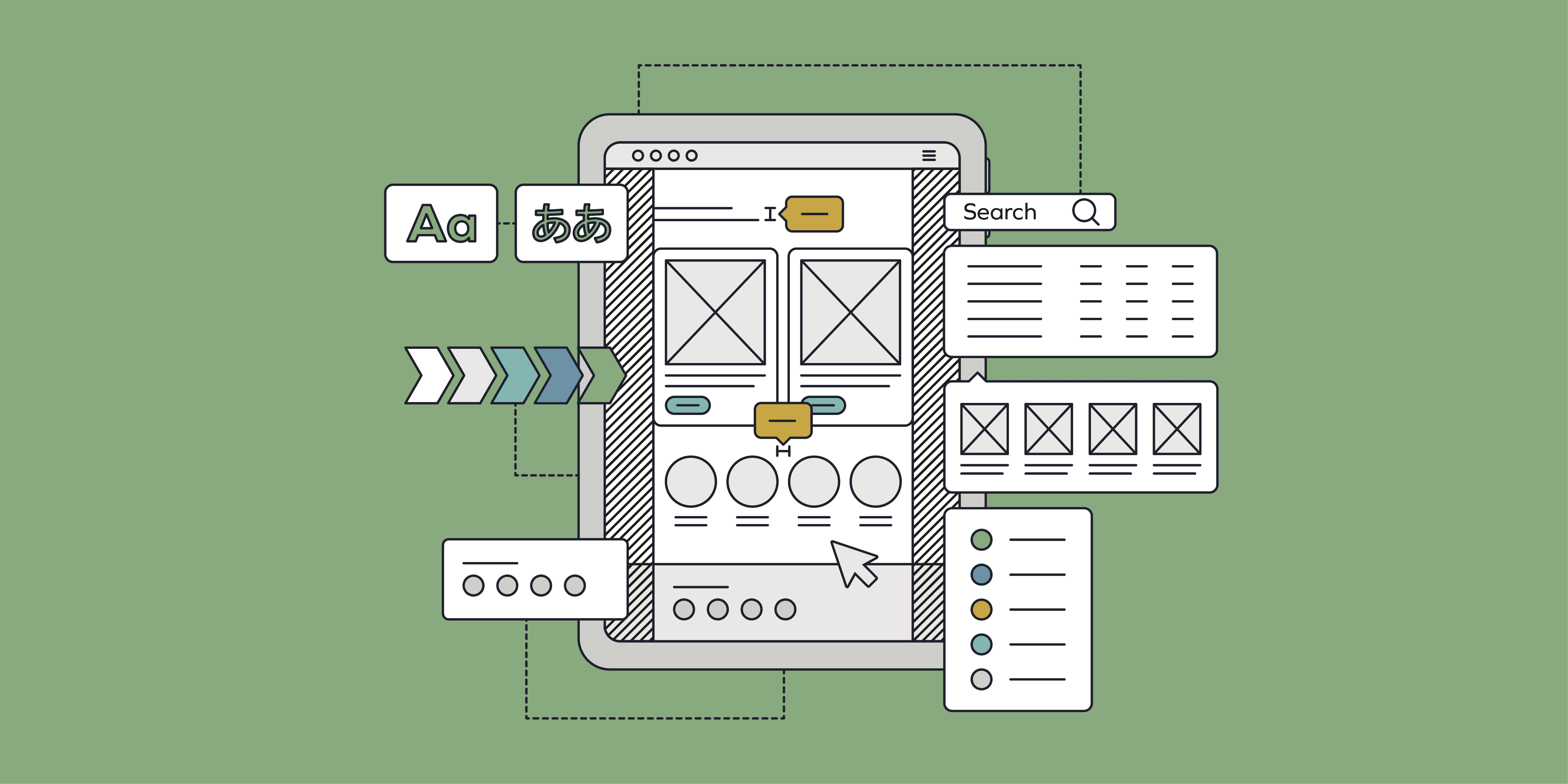
A navigation system can consist of all or some of the below. Get an overview of how each one can add value to your website and help serve your prospective customers with a smoother user experience.
“ Because plenty of site visitors won’t have landed on the site via the homepage, the global navigation gives people a clear sense of what else they can find on the site. ”
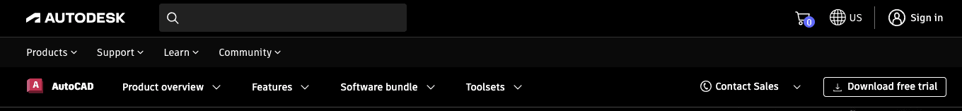
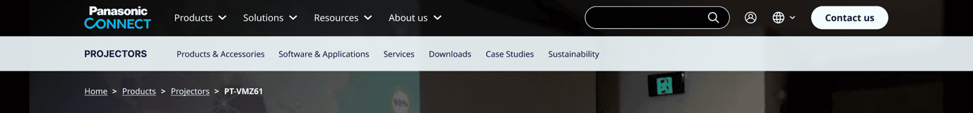
This is the primary navigation menu that appears on all pages of the website. It’s usually found at the top of the page but sometimes it runs down the left or right side. Global navigation gives users an easy way to get to the main and/or most important parts of the website. It also offers people a simple overview of the site structure. This is crucial as it gives users a more intuitive journey. It enables people to get to key parts of the site without having to go via the homepage.
Because plenty of site visitors won’t have landed on the site via the homepage, the global navigation gives people a clear sense of what else they can find on the site. Many sites use the global nav to mirror the site structure while also promoting pages in the nav that most visitors are looking for.
When a global navigation runs across the top of the page, you need to be considerate of the number of links that can feasibly be accommodated without the design looking crowded. In large organisations that have lots of business units, everyone wants their stuff in the nav. This can be a challenge. But by keeping the customer at the centre of the design process, we can help manage these issues. A little give and take is always needed.


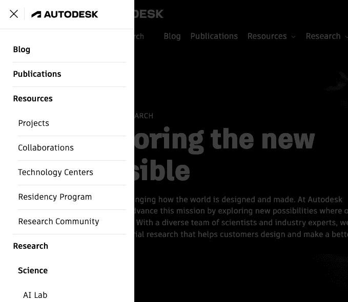
The hamburger menu is a global menu hidden behind three dashes. Typically, you’ll see these on mobile websites where screen space comes at a premium. However, more and more often we’re seeing these menus on desktop designs as well.
Traditionally B2B customers were more likely to browse websites using laptops and desktop monitors rather than their mobile phones. As such, responsive design was the last consideration. But now, with ‘mobile-first’ designs, hamburger menus are an obvious go-to design pattern that offers a familiar and predictable user interface.
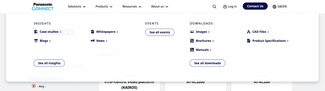
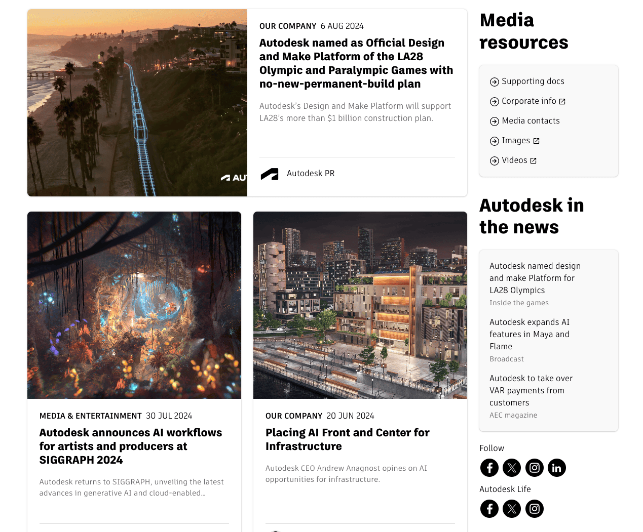
A mega menu displays multiple levels of navigation at once. It’s often triggered by hovering over or clicking a main navigation item in the global nav. Mega menus usually take up the full width of the page and provide people with easy access to the most important parts of a given section of the website. Because they are a part of the global navigation, they are accessible from any page of the website and reduce the need for users to know the site structure. They are particularly useful on B2B websites that offer a magnitude of products and services.
Often an element of the global navigation, the utility navigation provides the links to functional parts of the site including login, account, and language settings. These are useful for repeat customers who already have an account or for those that want to sign up. B2B sites are often multi-lingual to represent the various territories they operate in. Such sites may offer a quick and convenient way for the user to switch locale and language.


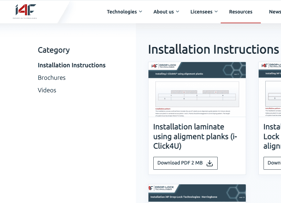
Secondary navigation is often found near the global navigation and provides people with a way of getting to the sub-categories and pages associated with a specific section of the site. This is particularly useful in B2B websites with extensive product lines or service offerings as it negates the need to create spin-off microsites for each business unit.
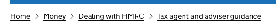
“ Breadcrumbs are also great for SEO. They help search engines understand what the nature of the website is and how it’s structured. Google uses them to crawl and index site content and sometimes displays them in search results, aiding the user experience. ”
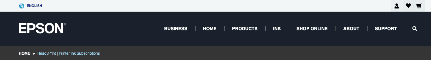
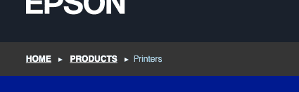
Breadcrumbs helps people understand where they are within the site’s structure, often relative to the homepage. When people use a search engine to find something specific, they rarely land on a site homepage. It’s more likely that they’ll land on a content page some way down the site hierarchy. Breadcrumbs are particularly useful in this scenario as they help people know where they are and how to quickly get to similar information without having to go all the way back to the homepage.
Where B2B sites are organised in a way that mirrors their business structure it can be hard for people to know where to go. By starting from the more specific content pages and working the way back up the tree, customers have a better chance of finding something useful to them.
The best breadcrumbs include the current page as the final item in the trail but do not self-link the page.
Breadcrumbs are also great for SEO. They help search engines understand what the nature of the website is and how it’s structured. Google uses them to crawl and index site content and sometimes displays them in search results, aiding the user experience.


A vertical navigation bar is typically located on the left or right side of the webpage. It’s used to display additional menu options or related content. The sidebar is useful as it helps users know that there is similar or related content to the page they are currently viewing without needing to scroll all the way to the bottom to find it. It’s also particularly useful for users who are in the ball-park area of the thing they are looking for but the page they are viewing isn’t quite the one. B2B websites can use the sidebar to highlight case studies, testimonials, and additional resources relevant to the service or product detail page.
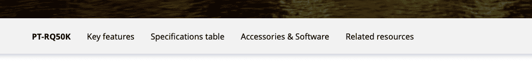
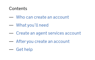
These help people get a flavour of what’s on the current page without having to scroll through first. The links in the content should therefore be descriptive and clear. A B2B customer might be scanning for testimonials and other evidence to support a purchasing decision. Or they might already know they want to buy and are looking to skip to the next step. Table of contents are usually paired with ‘back to top’ links. These typically take people back to the table.
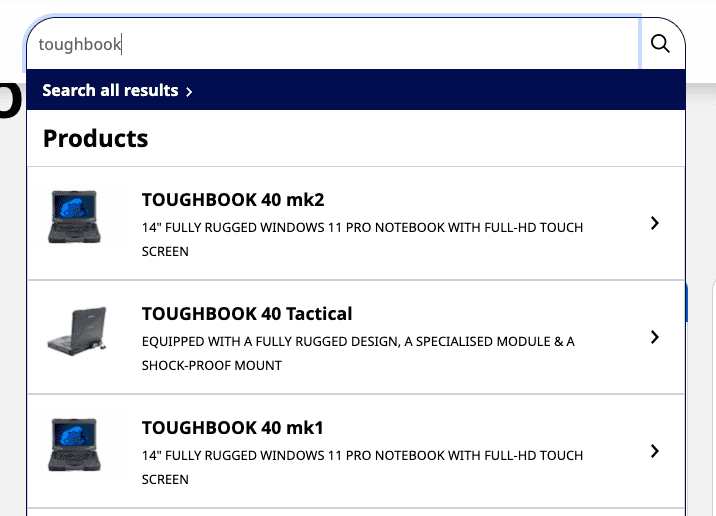
Site searches enable people to type keywords and phrases to find specific content, services, or products on a website. The best searches start offering relevant results as you type.
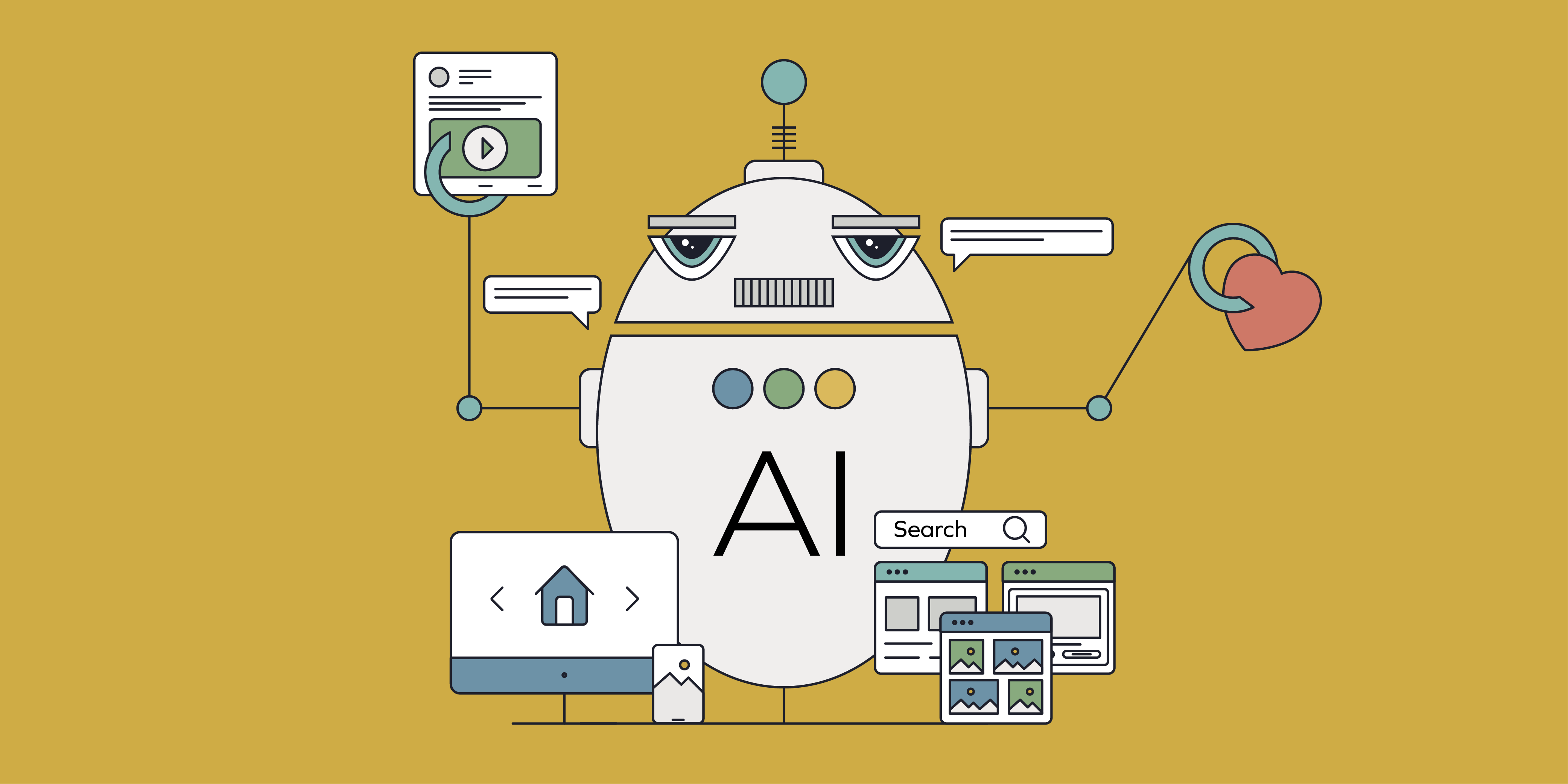
One step beyond search is a digital assistant in the form of a manual web chat or AI chatbot. By answering some questions, you’ll be directed to suitable results based on your specific needs.
The chatbot provides instant support, answering your users’ questions, offering product recommendations, and guiding them through complex decisions. This immediate assistance can significantly reduce friction and help your prospects move through the sales funnel more efficiently.
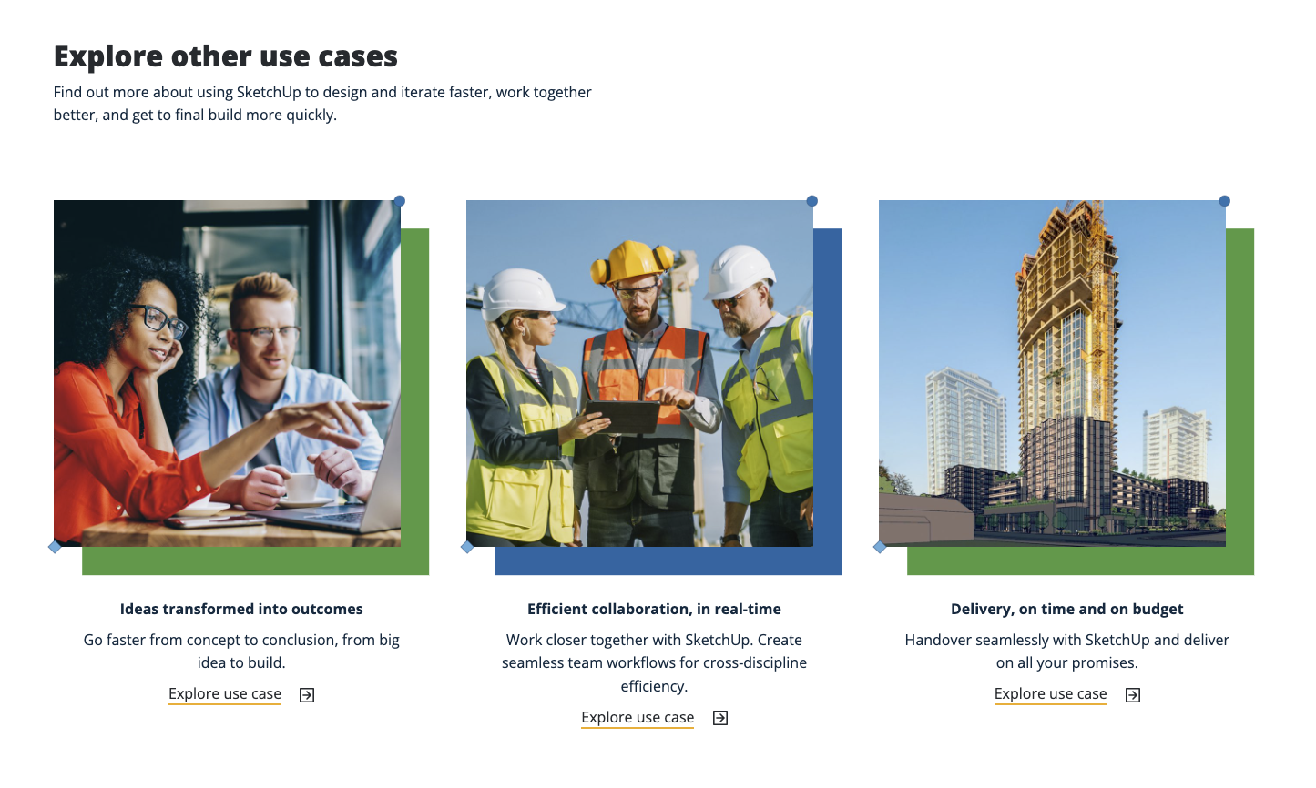
This is the related links and content that is either directly or tangentially related to the content on the current page. These links encourage further exploration and evidence to support B2B customers’ purchase decisions.
Footer navigation is like the global nav found at the top of web pages. You’ll often find many of the same links here, accompanied by lesser-used but equally important privacy policies, terms of services, and other legal information.
By offering additional navigation options, it ensures that users can always find what they need, contributing to a positive overall experience and supporting the company’s reputation.
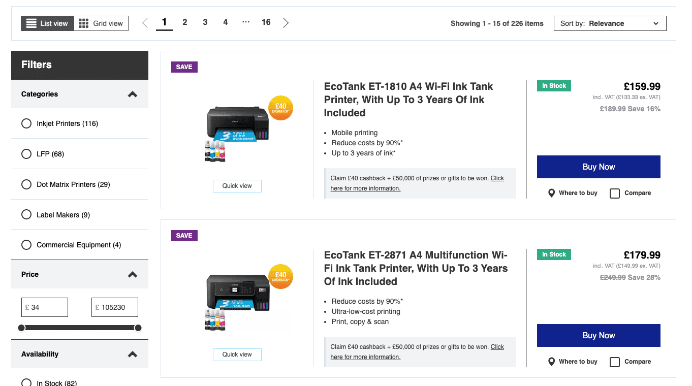
Faceted navigation is a system that allows users to filter and refine content or product listings based on multiple attributes such as price, category, features, and industry. This helps B2B customers narrow down large sets of options by including or excluding things by relevance.
Many sites have replaced pagination with infinite scroll, loading in more items into view with each scroll. Both methods have their benefits but where pagination is done well it enables people to easily know what they have already viewed while giving them a sense of how many more items they may need to trawl through before they find what they’re looking for. Users can easily bookmark and share a given page within the results. It’s important to note, this isn’t possible with a long scrolling page.
While B2B websites face many of the same challenges and solutions as B2C, navigation systems need to adapt to the niche business jargon, technology, and level of detail evident in the businesses serving other businesses. Testing, learning, and continuously iterating to improve your site will often pay dividends. It will also help you develop a deeper understanding of your B2B customer needs and expectations.
As always, keeping real customers at the centre of the design process helps ensure that navigation systems meet, manage, or exceed their expectations. Aligning to people’s mental models and frames of reference means they’ll have a better chance of finding what they need and discovering tangential offerings. Conducting card sort and tree test exercises helps with categorisation and hierarchy while usability testing provides a unique perspective on how people interact and move through the interface.
A navigation system refers to the structured set of tools, menus, and links that guide users through a website. It helps users locate information, products, services, and resources efficiently.
Effective navigation helps users explore complex product catalogues, find relevant content, and interact with the business. It supports conversions and reduces the risk of users abandoning the site due to confusion or frustration.
It enables users to carry out common tasks such as browsing for product specifications, obtaining pricing information, or setting up an account with ease.
It helps achieve goals like expanding market share and improving customer satisfaction by removing friction points and enhancing the user journey.
An effective navigation system should be intuitive, consistent, responsive, concise, hierarchical, accessible, inclusive, and scalable.
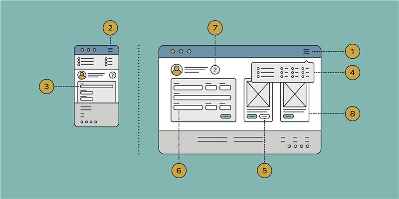
Elements include global navigation, hamburger navigation, mega menus, utility navigation, secondary navigation, breadcrumb navigation, sidebar navigation, table of contents, search navigation, chat/AI bot, contextual navigation, footer navigation, faceted navigation, and pagination.
Global navigation is the primary menu that appears on all pages, helping users access key parts of the website without needing to go via the homepage.
Hamburger navigation is a global menu hidden behind three lines, commonly used in mobile-first designs to save screen space.
A mega menu displays multiple levels of navigation at once, providing easy access to important sections of the website.
Utility navigation includes links to functional parts of the site such as login, account settings, and language options.
Secondary navigation helps users access sub-categories and pages related to a specific section of the site.
Breadcrumbs show users their location within the site structure and help them navigate back to related content. They also aid SEO.
Sidebar navigation is a vertical menu that displays additional options or related content, aiding users in finding relevant information.
A table of contents provides an overview of the current page’s content, allowing users to quickly jump to sections of interest.
Search navigation allows users to type keywords to find specific content, with the best systems offering suggestions as users type.
A chat or AI bot provides instant support by answering questions, offering recommendations, and guiding users through decisions.
Contextual navigation includes links to related content, encouraging further exploration and supporting purchase decisions.
Footer navigation mirrors the global navigation and includes additional links such as privacy policies and terms of service.
Faceted navigation allows users to filter content based on attributes like price, category, and features, helping narrow down options.
Pagination divides content into pages, helping users track what they’ve viewed and share specific pages, unlike infinite scroll.
Designing with customers in mind ensures navigation systems meet their expectations and helps them find what they need efficiently.

Get in touch to learn more about how your website is doing and what we’d recommend you adapt to optimise the navigation system.
Let’s chat