The future of web technology.
18th March 2022 • 5 mins
18th March 2022 • 5 mins

Each year that passes functionality that seemed impossible 10 years ago, or that required a lot of hacks and many lines of coded work arounds to do something remotely close to it, is becoming easier to do and widely supported by modern browsers.
This means we can create higher performing sites as the functionality is a lot less complex to implement and usually many lines of code shorter, and allows fully responsive and accessible designs to be achieved across all browsers due to the new technologies available.
We’re going to run through just a few of these to show how they might help your users.
First up one that is still very much in an experimental phase, the ‘Prefers Reduced Data’ media query.
The aim of this query is to allow you to switch your website’s styling to show a version best suited to the user’s performance needs. If the user prefers a reduced data version of your site it can be due to several reasons, for example, they could be on a mobile device and don’t want to use their data downloading large images and auto-playing videos.
Or they could have a poor internet connection, rather than having to sit through slow download speeds having to download videos and images that have no bearing on the understanding of the content, and serve as presentation only, they just want to have the core content shown to them.
If a user has this setting on their device, showing them a text only, or minimal images version of your website, will increase the usability experience of your site for them and ultimately allow them to get to the content they want quicker.
This one has been fully supported by browsers for a while now and is gradually making its way into more and more websites. The ability to detect, within CSS, if the user has set their operating system settings to use reduced motion.
This is most often something users who suffer with vestibular disorders, epilepsy, motion sickness etc, have set on their devices. They can get triggered by unnecessary and unexpected movement within a webpage and so using your website can make them physically unwell if you make use of large scale or significantly impactful animations.
Being able to tweak the delivery of your content, to remove any over the top animation sequences or unnecessary element movement for these users, goes a long way to making your site more inclusive and accessible for them.
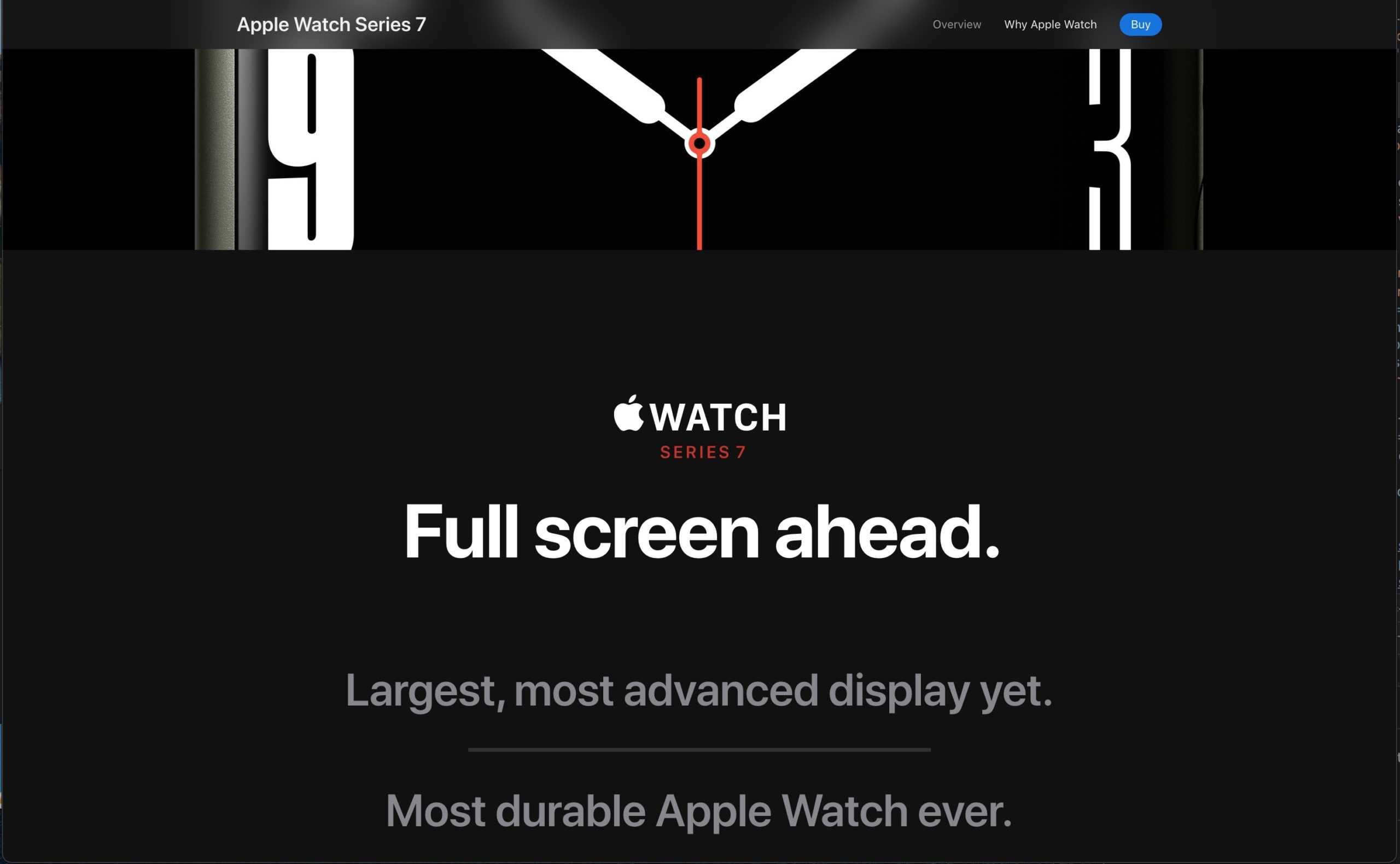
Apple do this very well on their product pages, which are known for their animations – if you toggle your reduced motion settings on for your computer or device and refresh the page, you will see they deliver a much more static experience, replacing all animations on the page and using different imagery to deliver the same content.

Another one still in the experimental stages is the ability to monitor the ambient light level for the device’s environment.
In the same way your device can be set to automatically change the brightness of its screen depending on the light level you are currently in when using it, this feature would allow websites to access that same information and change the styling appropriately to cater better for the environment you are in.
Much like your car’s sat nav changes to a night mode to display using a darker colour palette, your website could incorporate the same functionality if it detects you are currently in a darker environment.
The ‘prefers-color-scheme’ property in CSS has been fully supported by modern browsers since mid 2020, so you may have noticed the increase in websites displaying their content to you with a dark theme as default if you have that setting turned on on your devices.
This CSS query allows us to detect if the user has set their device to run on a light or dark colour theme. Light being a white, or similarly light coloured, background with dark coloured text, and dark being the reverse, a black or similarly dark background using light coloured text.
Obviously if a user has set their device to display everything in a theme, you can assume that they would like their online content to be delivered in the same preference. however, depending on your content, this isn’t always the case, so it is always good etiquette to offer the user the ability to switch between themes.
Some users with visual impairments will find higher or lower contrasts benefits them and improves their ability to use a website. So being able to access this preference set on their operating system and style your website accordingly will make the user experience much greater.
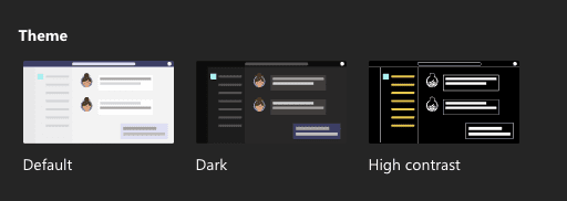
Microsoft Teams for example, currently allows you to pick a high contrast theme option.

The ‘prefers-contrast’ query is currently supported by most modern browsers, with Firefox currently the only one to still have it under an experimental flag, which means it can be turned on by a user in preferences but isn’t enabled as default yet.
Creation of a high contrast palette during the UI design of websites is something you can expect to see more of later this year and next year, in the same way we have seen with the growth of websites offering dark themes over the past 2 years.
As you can see, over the next year the ability for us to customise how we deliver online content to suit the preferences requested by individual users will be greatly increased. This gives us more power to extend a great user experience to everyone, regardless of their physical or logistical limitations, and allow all users to focus on what is important, the content.
If you’d like to better understand how new web technologies can benefit your own company website then please get in touch, we’d be happy to discuss this further with you.
