Autodesk Tandem

A website evolution to accommodate new audiences

Autodesk Tandem

A website evolution to accommodate new audiences

Stats

164%
Increased organic traffic
155%
Average session duration increased

The challenge

The innovative digital twin solution Autodesk Tandem was being developed and, as a result, our client came to us to redesign their marketing website. They wanted it to better reflect the enhanced product offering and speak to a broader audience.

With the software now catering to the needs of architecture, engineering and construction (AEC) professionals and the owners and operators of buildings, one core challenge for the project was ensuring the language was appropriate for our audience’s varying levels of technical knowledge.

To meet Autodesk’s business goals, the new website needed to increase engagement with existing Autodesk customers and generate traffic and registrations/sales with these new audiences too.

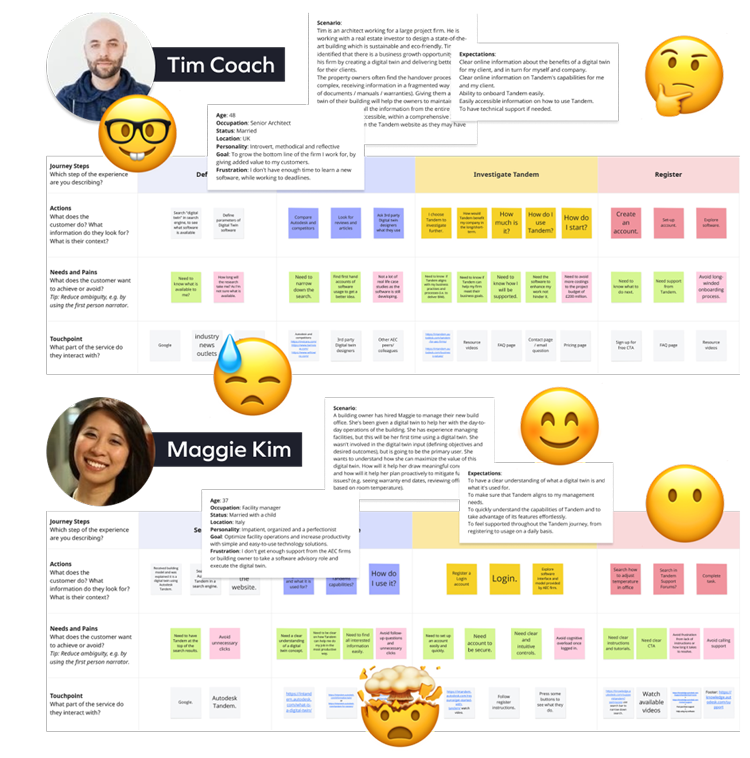
Two examples of personas and customer journey maps

Balancing the different user needs

To ensure everyone’s needs were catered for, we set about crafting a more user-centric experience. We started the project by creating personas for an AEC professional, a building owner, and a building manager.

The team wanted to identify our prospective users’ different skillsets, motivations, and challenges to truly understand how best to serve the digital twin solution to them.

Afterwards, we produced customer journey maps describing each of the persona’s steps from discovery to use of the product. Their actions, needs, pains and emotions were all documented, highlighting opportunities we could capitalise on. These insights directly informed our designs and content creation. Focusing on these core profiles throughout the project helped us to remember what we were trying to achieve and for who.
Creating smooth user journeys

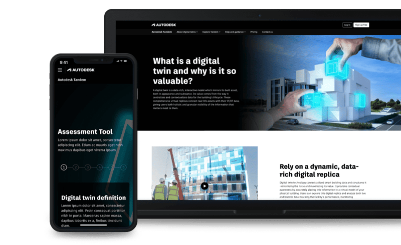
The team envisioned a simple and condensed architecture that’s easy to navigate. We wanted to offer a consistent experience across devices to avoid fragmented journeys. And to ensure the product slotted into the Autodesk portfolio, the UX and Creative teams worked in close collaboration to develop a cohesive UI and design.

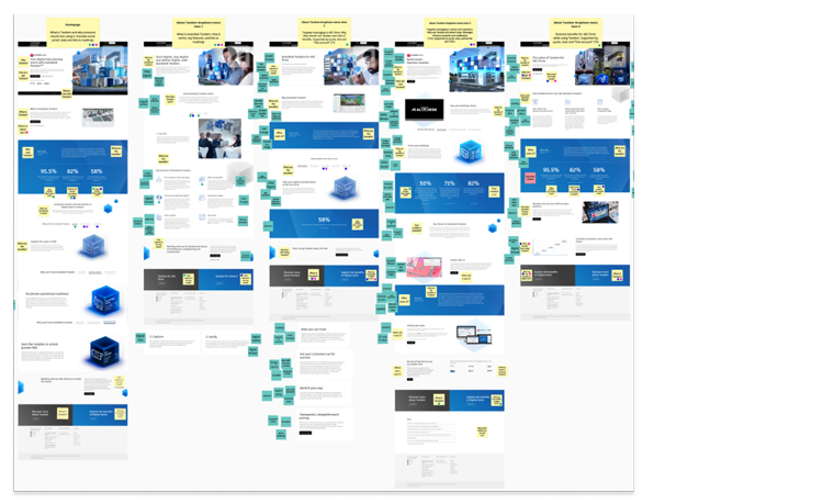
Screenshot samples of the previous website with post-it notes, depicting type of content and if it was useful to the personas.

Reviewing what we had

Our next task was to analyse the existing website. So, we conducted a content inventory and audit. Some sections were still relevant, while other content was too specialist and focused on the original AEC audience.

We also looked for opportunities to streamline the new website to minimise the risk of cognitive overload on this rather technical topic. For each page, we created a content summary and noted down our observations.

Positioning the Autodesk product

Based on our research and audience insights, we worked with the client to redefine the positioning of the product. This needed to align with Autodesk’s tone of voice, while being inclusive of those with less technical backgrounds.

Once we had established a compelling value proposition for the holistic product offering: the digital thread that binds the entire built asset lifecycle, we looked at what Autodesk Tandem offered the different audiences. For the AEC professionals, we established the value proposition as: develop smarter buildings. And for the building owners and managers, we went with: achieve operational excellence.

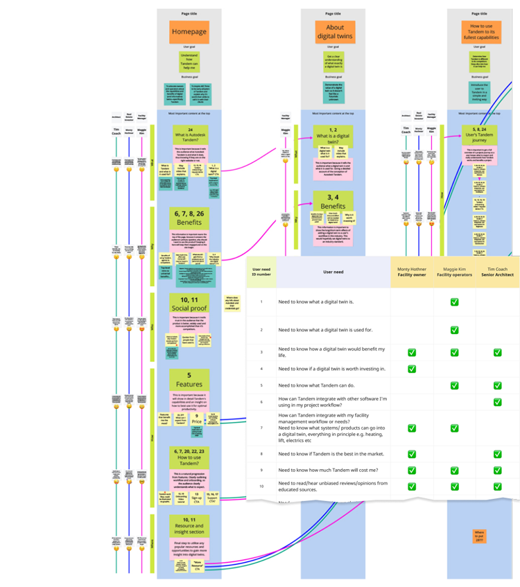
Low fi example of the 1st draft of content planning. Includes empathy journeys of all 3 personas and a sample of the user needs inventory table.

Prioritising the content

Using the tool, Miro, we ran a collaborative content priority planning workshop. Starting with the homepage, we plotted the content in the order that we collectively agreed was most appropriate – based on what we knew of our audiences. When we felt a topic needed further explanation, we created a dedicated page for it.

We presented the plan to the client with user flows and empathy journeys, describing thoughts and actions of each persona, at each stage. This bridged the previous discovery work with our proposed solution and solidified our thoughts and assumptions.

With a well-established visual identity already in place, we leveraged existing components from Autodesk’s design system to build out our initial wireframes.

Getting that balance right between keeping Tandem’s individuality as a product while still embodying the Autodesk brand was a fun challenge. The creative concept of the images from the previous website remained in place but we updated the treatment of them to be more consistent with the Autodesk brand guidelines. The new illuminous data cubes on the black background give an extra graphical element of personality that seamlessly combined the individual product and the overall brand, completing the website’s fresh new look.

Getting into the detail

From a copy-perspective, the client wanted the website to be persona-agnostic throughout. To achieve this, we relied on the product’s segmentation. We made the content easy to navigate for the respective personas by signposting either Twin Building, the AEC product environment, or Insightful Operations, the owner and operator software environment.

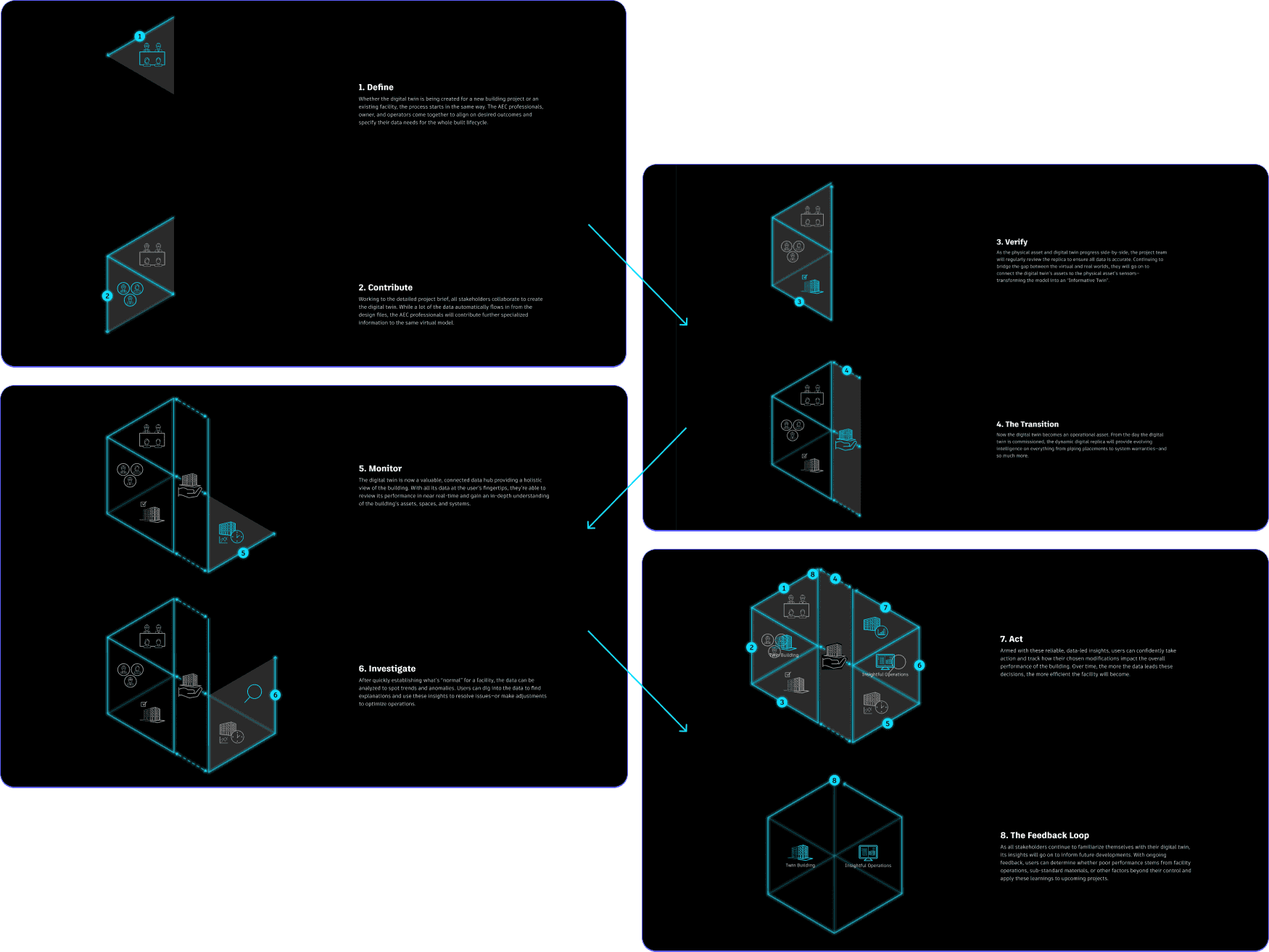
Keeping the varying needs of our audiences front of mind throughout the development of the sitemap and wireframes, we saw an opportunity to explain how the two product offerings come together. Not only does Autodesk Tandem align the people involved in the entire built asset lifecycle, but it also makes the building’s data readily accessible to everyone too. We broke this complex information down into an interactive infographic with simple language and visuals.

One of the key challenges of an emerging technology is proving it’s worth investigating and investing in. With this in mind, we also wanted to showcase Tandem’s capabilities through case studies. However, due to the time constraints and the software’s infancy, it wasn’t possible to include these for launch. We knew social proof was an important part of the ‘sell’ though, so we used stats and testimonials from industry leaders to validate the value of the product instead.

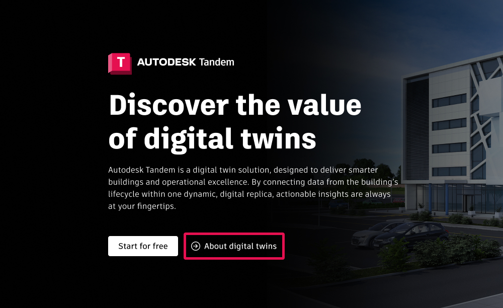
A resource library was another priority to help onboard users less familiar with Autodesk products. However, with building owners and operators being such an important target audience for this refresh, we also wanted to give them a quick route to the explanatory content that they may be looking for. As such, from the moment a user lands on the site, we offer an answer to the most important question a novice will have: what is a digital twin? Meanwhile, still offering a discovery flow for others with more advanced knowledge.

Juggling time constraints

With the product still undergoing development as we were working on the website, new information was coming in regularly. Soon the release date was looming and time wasn’t on our side. It was this stage of the project that really tested our flexibility. In order to deliver on time, our development team needed to make a start. So, when we felt confident that the layouts weren’t going to change, we pushed forward with finalising the responsiveness of the designs for smaller devices and handed things over to our in-house developers. This process bought our clients a little more time to review and finalise the content in collaboration with our copywriters.

The results

Within the first six months of launching the redesigned website, there was a significant increase in organic traffic – a whopping 164%. The website also demonstrated remarkable growth in engagement, with the average session time for new users being just over three minutes. This exceeded the previous six-month metrics by 286%. Furthermore, across all users, the average session duration increased by 155%. And the cherry on top? We have a grateful, happy client:

“Torpedo’s work on intandem.autodesk.com was not just a display of creativity, but also a testament to their deep understanding of a complex audience landscape. They crafted a user journey that speaks uniquely to the varying levels of understanding and maturity in the digital twin space. By intuitively navigating through the intricacies of each target audience, they created a flow that both engages and caters to their unique needs and knowledge base. This thoughtful approach has significantly enhanced the user experience, making it accessible to all.”