Why is Alt Text important and how do I write it?
17th June 2021 • 5 mins
17th June 2021 • 5 mins

Alternative text.
If you work in digital marketing you’ve probably heard of it before, and think you have a good idea what it’s for, it’s even asking you for alt text on your Instagram posts these days, but do you know how to write good alt text?
Well written alt text isn’t just a necessity for the accessibility of your website, but it also contributes to your SEO ranking, as it gives semantic meaning to your site.
The job of alt text isn’t to repeat what information is already available as text on the screen, the user can already read that, or have a screen reader read it to them. It is to ensure the context or function of the image isn’t lost for those who cannot see it.
Alternative text is mainly required in two circumstances. Primarily, when a visually impaired user is accessing your content and cannot physically view your image it is read out, and secondly, if a page is being slow to load images or they are unable to load at all, if a user loses signal on a train, for example, halfway through loading a page, then the text is shown in the image’s place.
The alt text ensures your user can still get all the information they need from the page, despite not seeing the image content first hand.
This largely depends on the image content, there is no right or wrong answer, however the JAWS screen reading software used by visually impaired users has a maximum line limit of 150 characters – so alt text entries should aim to be less than this.
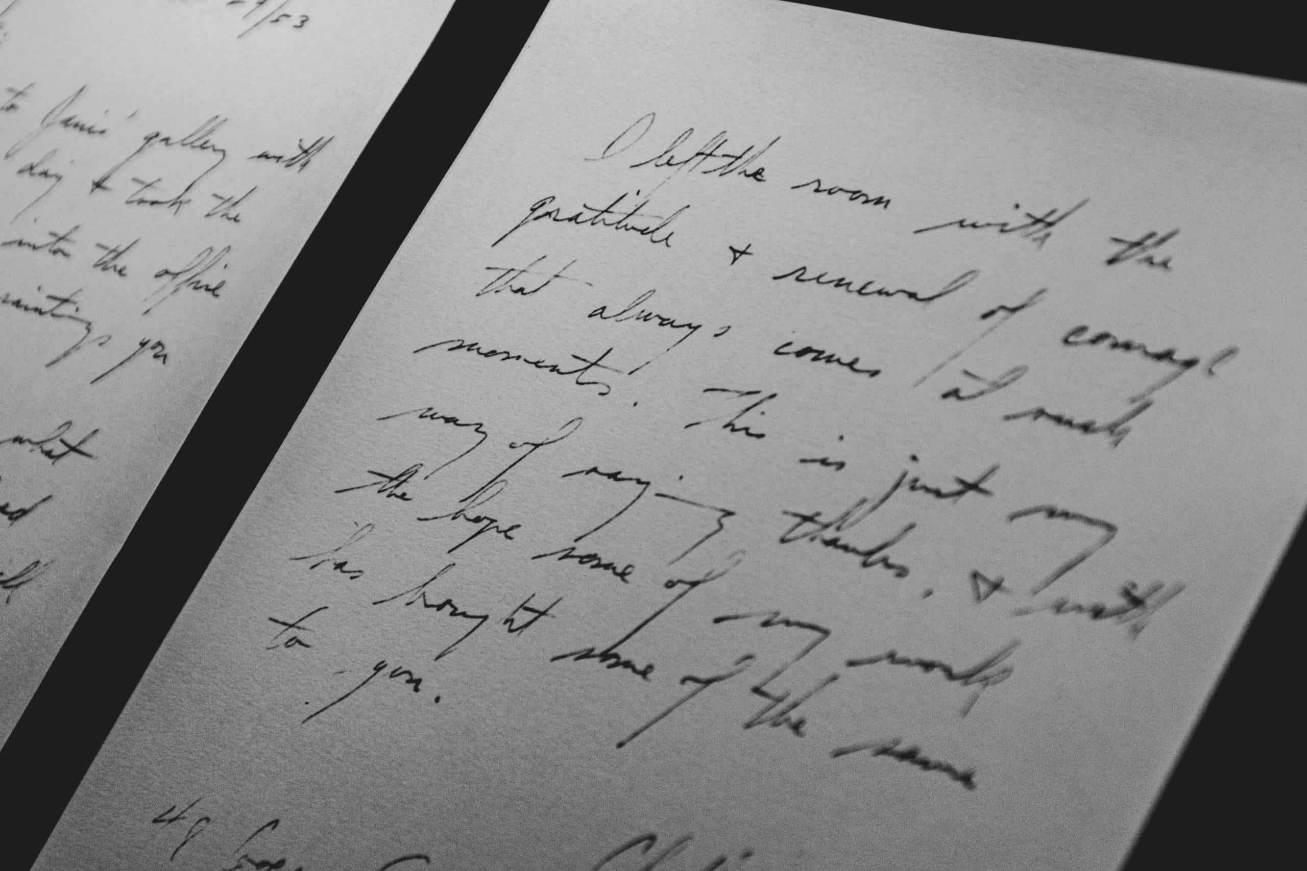
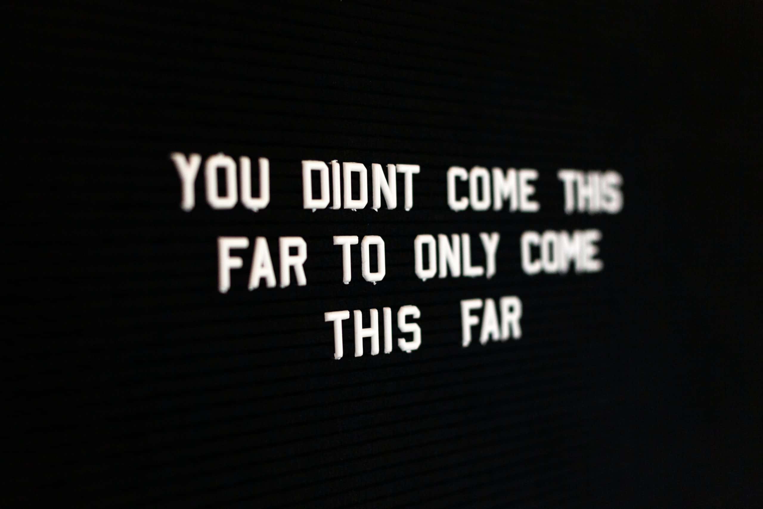
If an image contains any text content the user needs to gain understanding, this should always be entered as alt text.
Take the image below for example, the text is the focal point of the image, if a user doesn’t know what the text says they lose all understanding you were intending to convey with the image, so the full text should be transcribed.

There are exceptions to this however, as mentioned above, don’t repeat yourself. If text in the image is used as the caption or title for example, it will already be accessible to the user, so you don’t need to transcribe the image text, as it means the user will get it twice.
Similarly, if there is only a certain part of the text that you are wishing to highlight in the image, then only transcribe that part – you only need to transcribe what is important for the user’s understanding.
A mistake often made is starting an alt text entry with “Image of…”, you don’t need this level of detail, the user will know it is an image by the fact they are seeing/hearing the alt text.
Apart from that however, there isn’t one right or wrong answer to the level of detail. You don’t want to write a story, but also you are unlikely to convey enough information with one word – but it depends on the image and the context it provides.
Take the image below, a man outside holding a bottle of soda. Depending on what the image is used for that description could work as your alt text and be perfectly acceptable. If the picture is being used to demonstrate something about the area where the photo was taken, then more focus needs to be on the mans location, where he is, mention the landmark behind him.

If however the image is being used to promote the drink he is holding, then the user doesn’t need the detail on the location specifically. Instead, you would want more detail about the drink – it’s colour, the fact it is a glass bottle.
What your alt text focuses on is entirely based on what context it is being used for.
Here’s another example…
Take a look at the flamingo picture below. Simply setting the alt text as “Flamingoes”, is perfectly fine here – it’s accurate, to the point, and the user knows what they should be seeing. Is it important though, that the user knows what the flamingoes are doing, the predominant colours, where they are or how many of them there is?

This is entirely dependant on the context it is being used, but “Flock of flamingoes drinking water”, would probably be more useful to the user, whilst still being succinct, as an initial alt text entry here.
If you want a more in depth look at the thought process when deciding what to write, there is a great walkthrough on the WebAim website.
Ultimately, having any alt text is generally better than having none, certainly for the experience of visually impaired users on your website. But thinking about the context and function of the image you are describing will help you write better quality alternative text.

If you’d like support in putting any of these into practice on a new project, or deciding what would work best for you, send us a message or give us a call.
Get in touch