How to increase B2B leads with web accessibility

21st May 2024 •
21st May 2024 •
According to the Department for Work and Pensions, 16 million people in the UK had a disability in 2021/22. That’s 24% of the population. 23% of working-age adults have some type of disability, compared to 45% of adults over State Pension age.
When you consider nearly a quarter of working-age adults have a disability, that’s a lot of potential customers your website could be preventing from contacting you if you haven’t considered their needs. And a lot of potential customers up for grabs if you have.
So, let’s look at how the web design choices of one (fictitious) business can impact visitor engagement. How a few small details can hugely influence trust and credibility – and for users with specific disabilities, impede or encourage them to make contact.
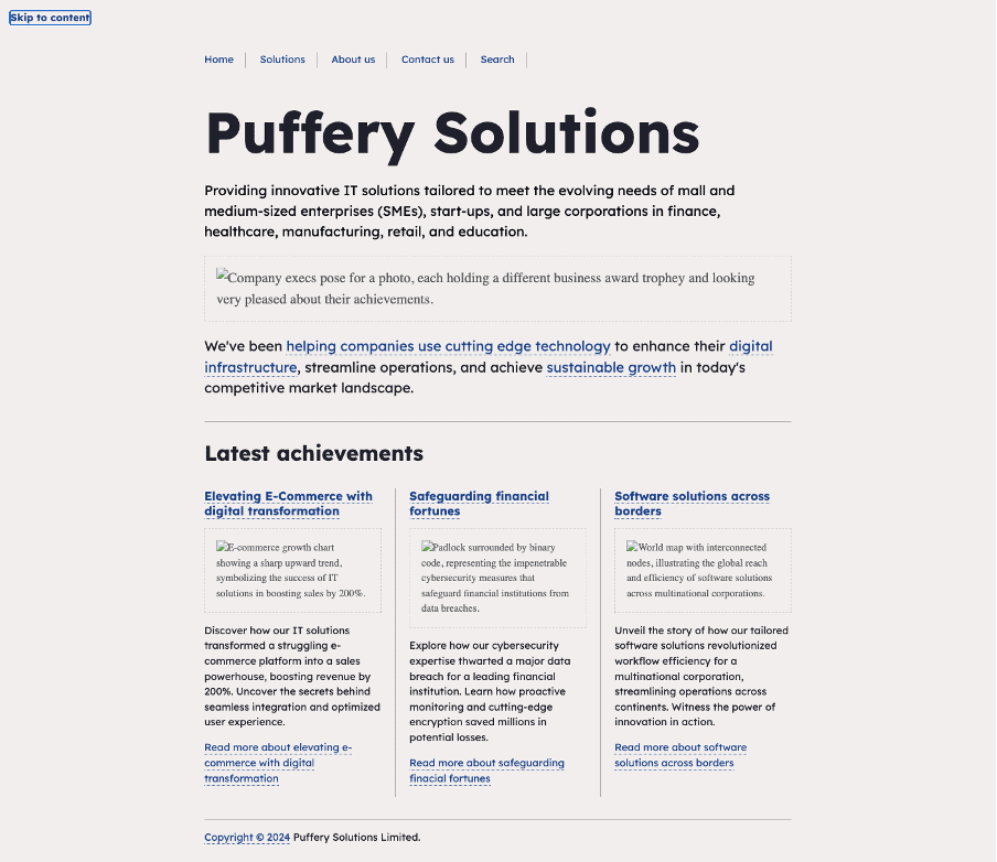
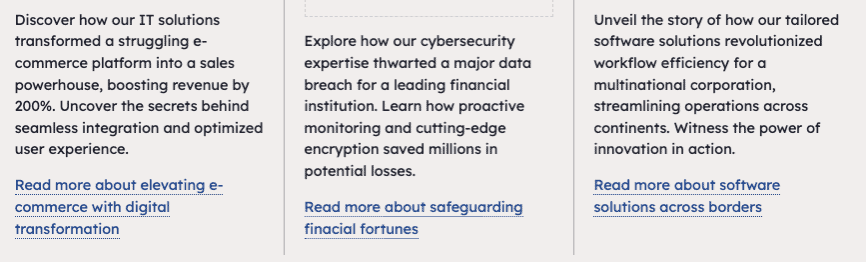
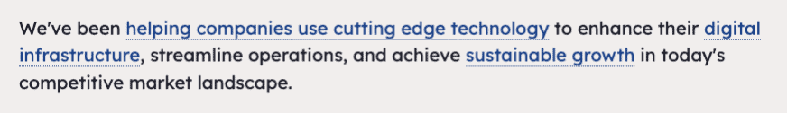
Meet Puffery Solutions; a forward-thinking B2B company. Puffery specialises in providing IT solutions that meet the needs of start-ups, small and medium-sized enterprises (SMEs), and large corporations, across finance, healthcare, manufacturing, retail, and education.
They aim to enhance their online presence, attract qualified leads, and drive business growth through their website. Key objectives include:
Customers are typically drawn to the website via targeted messaging that highlights the PS team as seasoned IT professionals with extensive industry experience and expertise across a wide range of technology domains.
Now let’s look at some of their potential customers, their needs, and what the barriers could be to contacting Puffery Solutions.
Sarah heads a manufacturing company looking to upgrade their outdated IT infrastructure. Sarah has dyslexia, which affects her ability to read large blocks of text and process complex information quickly. Her hearing has declined recently, too.
Sarah needs:
This comment goes for the rest of the blog which is following the same pattern. Rather than position her challenges and then come back to the later in the blog, I think we need to address straight up how Puffery Solutions has designed its website to be accommodating to her needs.
This is also a change in how the last part of article is positioned. Instead of focusing on what Puffery Solutions didn’t do right (which takes things in a negative direction), let’s pretend they did implement the best practices for individuals and celebrate how this helped the user to achieve their goals and as a result drive leads/ROI for the business.
Captioned multimedia content.
Sarah finds it useful to turn on captions for videos like she does on YouTube. She’s relieved to find the video content on Puffery Solutions offers captions too. (If not, she’d have searched for a transcript option instead.) The short video was super-useful in evidencing Puffery’s suitability for her requirements.
Mark is the go-to IT guy at a progressive healthcare organisation. His company places a high value on accessible inclusivity. He’s been tasked with migrating their on-premises infrastructure to the cloud.
Mark is blind and relies on screen reader software to access and navigate websites.
Mark needs:
Accessible navigation menus.
Puffery’s website has foregone complex navigation menus that rely on mouse-hover to reveal the menu options needed to get to content pages (particularly frustrating to Mark). This mean that for once, Mark’s screen-reader doesn’t skip straight over the links leaving him confused about how he’ll get to the sub-pages of the site.
Most of the images on the site have alternative text (alt text) which helps Mark understand the meaning they convey to non-blind people. The alt text has been well considered, so instead of his screen reader announcing things like “Image of person” and “puffery003.jpg”, Mark misses nothing.
Mark is always negatively impacted by auto-playing videos – the audio competes with his screen-reader. Providing controls to pause or mute the media helps prevent unintended disruptions and ensures a more inclusive browsing experience.
Because he’s visually impaired, Mark can’t take advantage of photos and icons that usually give context to multiple ‘Read more’ links on a webpage. Instead, he asks his screen reader to read out the page to make sense of where he needs to go next.
This connects to my previous comment and all the paragraphs below. Let’s position them in a positive light, i.e, Puffery Solutions did these things which helped the user meet their goals, and the business achieve their goals as a result. Let’s also deal with these in context of the users above, rather than wait to list them all at the end.
Once Mark is happy enough with PS to hit the contact form, he breathes a sigh of relief; he isn’t greeted only with a captcha (completely inaccessible to him as it relies solely on visual). Instead, Puffery provides alternative methods of verification, such as audio captchas or text-based challenges.
Alex is a marketing manager at a retail company interested in exploring custom software development solutions. He is looking for a tech partner capable of delivering software solutions tailored to his company’s unique needs.
Alex has attention deficit hyperactivity disorder (ADHD), which affects his ability to maintain focus and process information in a linear manner. He’s also red/green colour-blind which affects 8% of the male population. Puffery Solutions appeared to him in organic search results.
Alex needs:
PS has invested time and effort into its corporate colours and how they play out on their web pages. A low colour contrast between text and background elements makes content difficult to read for Alex who has red/green colour blindness. On many other sites, he completely misses the inline links which take him to things like lead-generation forms.
Like Mark, Alex finds auto-playing videos distracting. It takes his focus away from other content that’s more relevant to his needs. Deciding against auto-play was an easy decision for PS, and it means Alex lingers longer on the site.
Chris manages operations at a logistics company, tasked with optimising inventory management processes. He’s researching digital transformation solutions.
Chris has limited manual dexterity due to arthritis, which affects his ability to use a traditional mouse or keyboard.
Chris needs:
Once again, Puffery Solutions’ simple navigation pays dividends. Chris doesn’t use a mouse, so his go-to method is using his keyboard to tab through the menu. He can also switch to the touchscreen which enables him to see the sub-menus, so he’s soon confident he isn’t going to struggle with the rest of the site.
While our fictitious company got it right, not all websites make life so easy. However, all of the issues highlighted can be resolved and are technically straightforward. The World Wide Web Consortium’s Web Accessibility Initiative includes tutorials and checklists for ensuring that navigation menus, images, videos, colour, layout and much more are accessible to all, regardless of disability. There are plenty of expert consultants, Torpedo included, who can audit your site and make recommendations for improvement.
With permanent and temporary disability being an inevitable fact of life, it’s important to employ techniques at all stages of design, development, and content production to ensure you aren’t inadvertently excluding users. The simple step of enhancing your user personas with real-world struggles from people with additional needs can help you, your designer, developer, and content creator think more inclusively.
And remember, this is not just about the obvious moral and legal obligations. With such a significant proportion of the population living with some form of disability, giving them a user experience that helps them can also help you to reach your business goals more easily.

Contact us today for a free accessibility health check of your website.
Get in touch