Web trends on the rise in 2021.
27th January 2021 • 5 mins
27th January 2021 • 5 mins
Now we’ve all got back into the work routine and are focused on the year ahead, let’s take a look at what design trends are proving to be popular this year on the Web.
After a year in which the way we worked, socialised and communicated was dictated by the pandemic, unsurprisingly this has also had an impact on how websites and online experiences are being used.
Obviously the main restriction of 2020 was meeting up in groups, which meant large scale events like trade shows and conference had to move online, and online shopping was brought to the forefront of everyone’s lives.
So it’s no surprise that one of the biggest uptakes in 2021 is the Virtual Experience website, ways of replicating the “in real life” experience that the majority of the world is unable to carry out currently.
Giving users an immersive real world experience through vision and sound is even more important whilst they’re unable to explore physical spaces themselves.
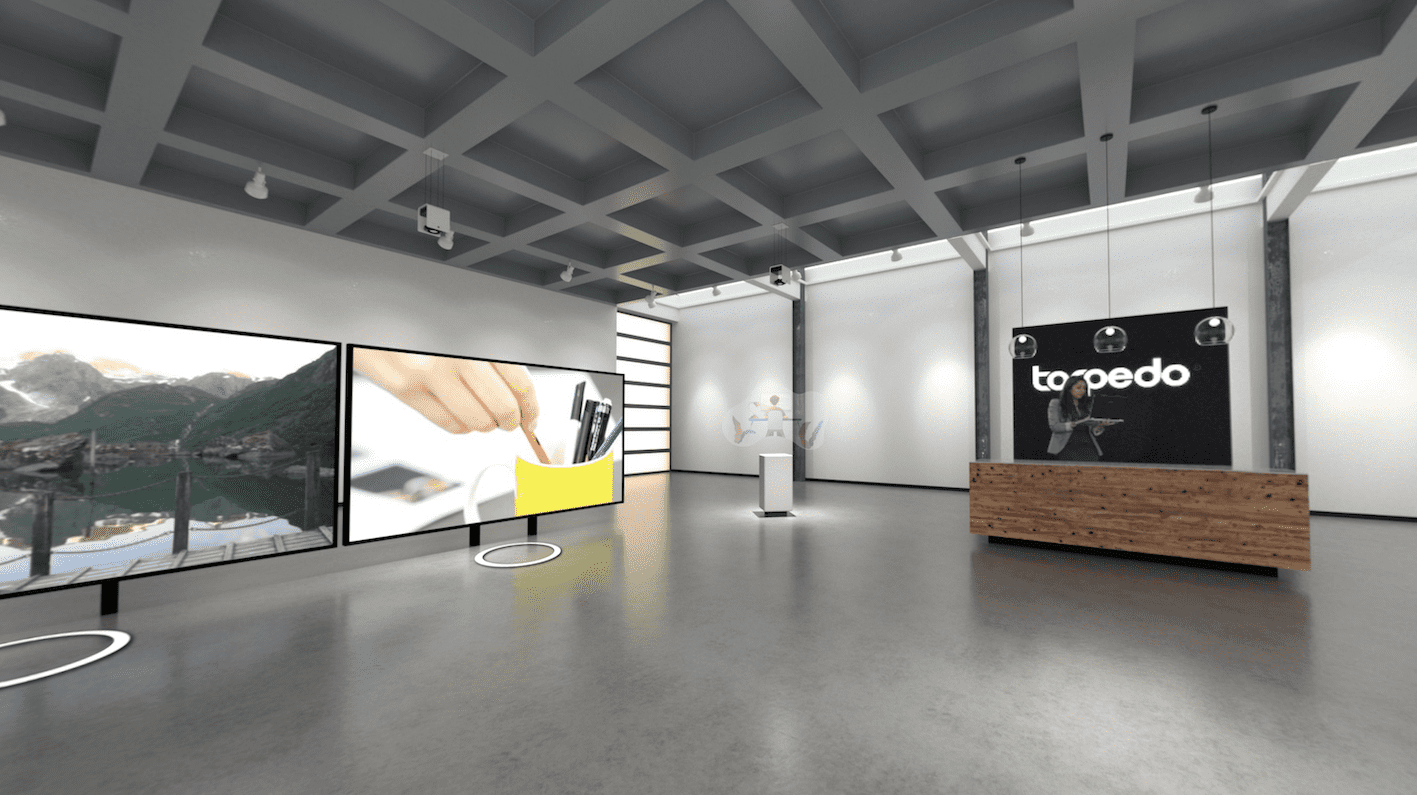
Online stores and showrooms that allow users to replicate that in store feeling are just one step to the online experience.
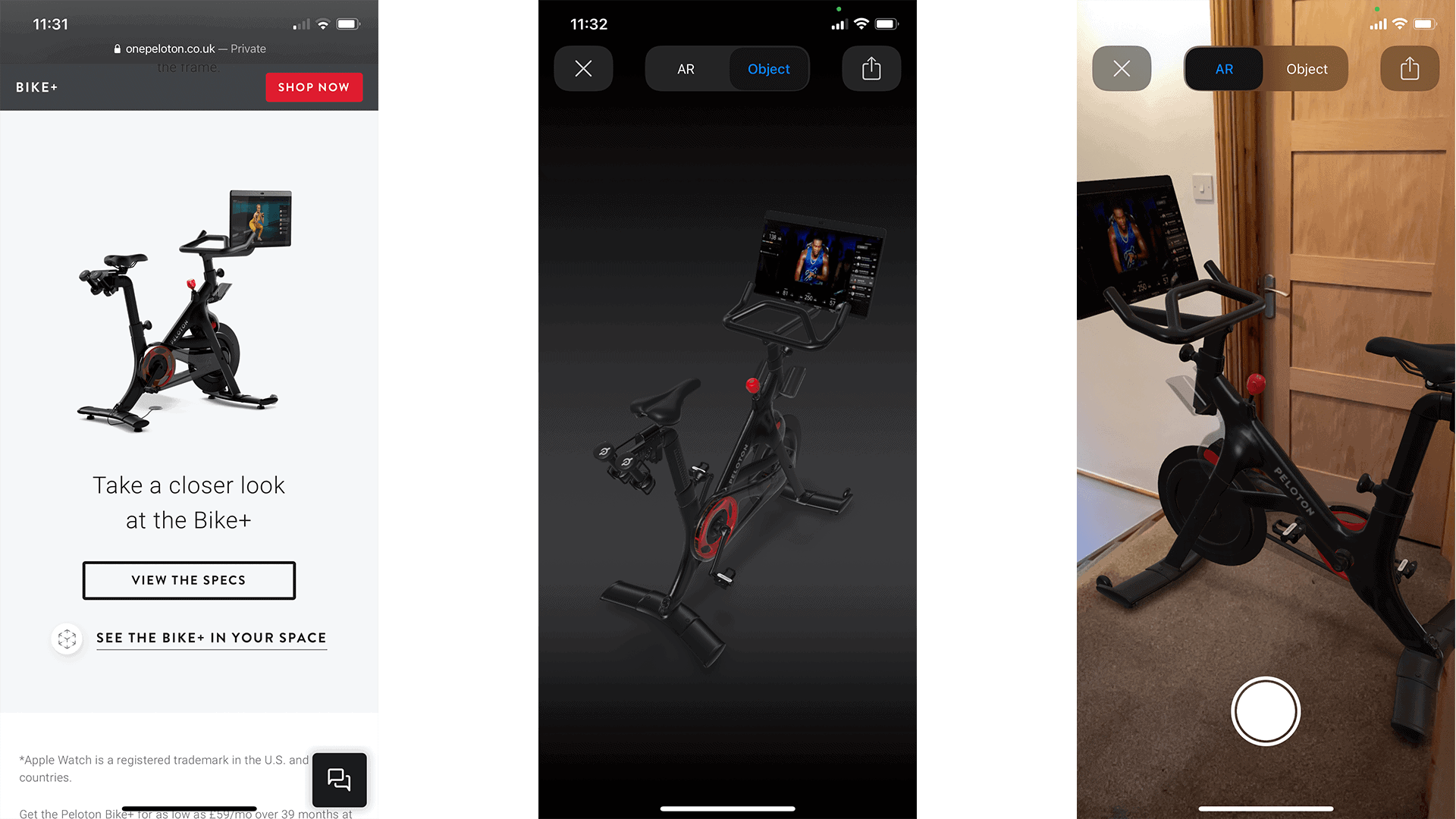
Brands like IKEA offer an augmented reality (AR) viewer to enable you to see if the piece of furniture you like the look of fits in your living room. Similarly, Peloton allow you to visualise just how much room that bike will take up and if it will fit in the space you’ve marked out for it, essential when customers can’t go to scope out the size of a product for themselves.
Following the increase in VR and AR it correlates that 3D content would also see an increase in popularity too.
Whilst it’s easy to assume this is via media like 3D models it’s not only limited to that. The trend also encompasses illustrations and icons on webpages, anything to provide some depth, like embossing effects on hero text and imagery or shading on icons – like Apple introduced with their Big Sur OS.

Another popular trend is to add some texture to designs, often achieved by adding blur effects to backgrounds, or some noise to images, to appear less polished and add some character. Something different from the day to day solid block colour backgrounds we’ve become accustomed to seeing on the majority of websites.
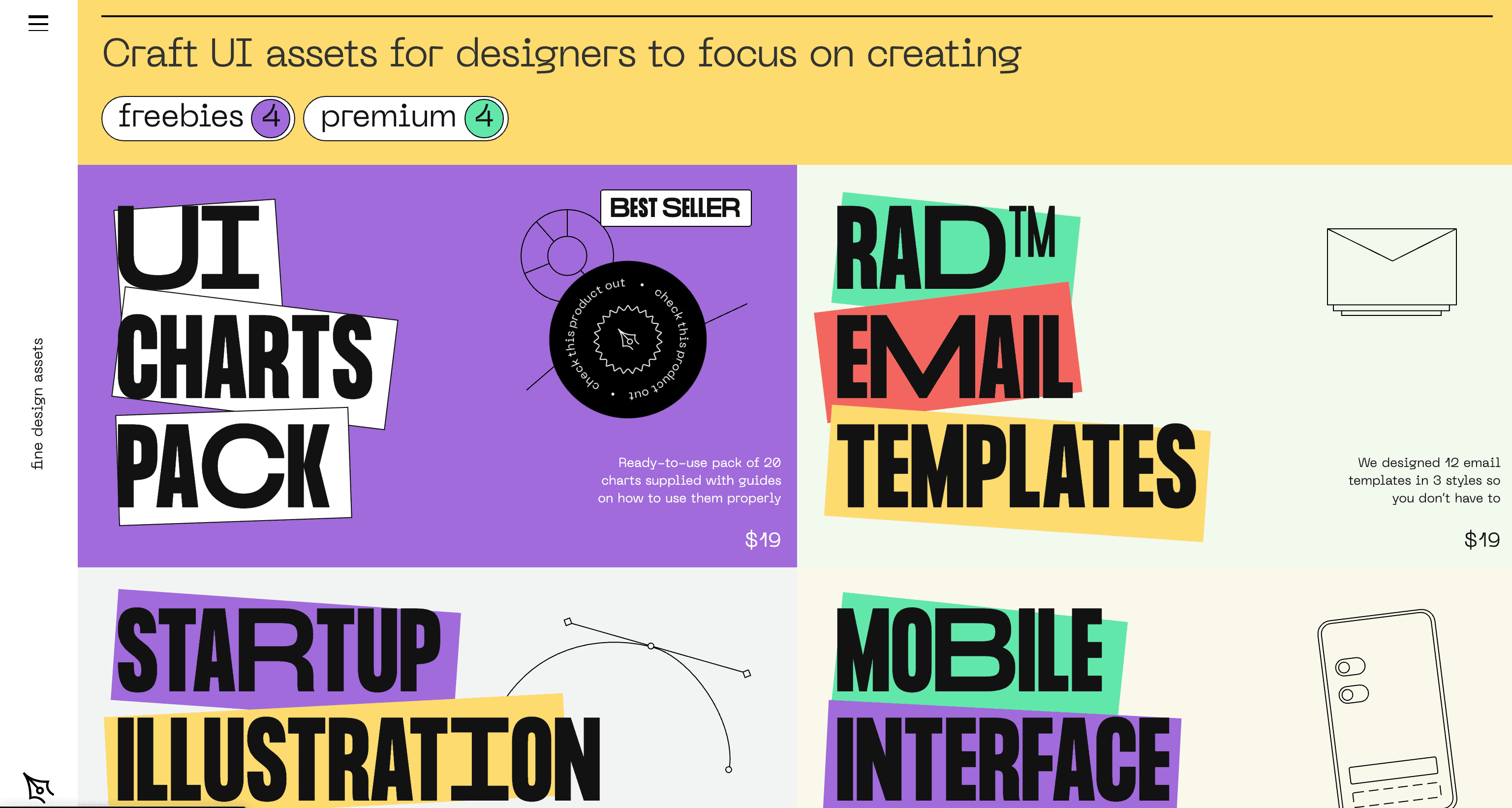
Following nicely from the texture trend is also the increase of abstract colour blocks in place of stock imagery, or also blending graphics with imagery to add some colour. These can be blocks of colour or a collections of shapes to make patterns – all can be used to break up a page of text and help it flow.
The indicius site is a great showcase for combining colourful vectors to bring the page and illustrations to life,

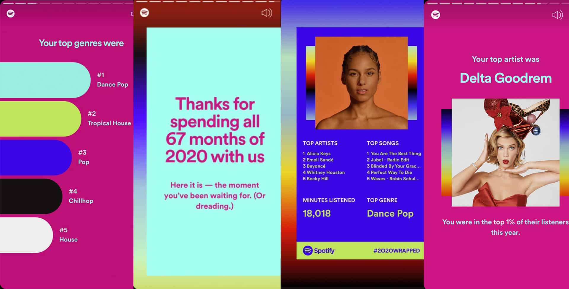
This has been growing in popularity over the last few years, most notably showcased in the Spotify End Of Year Wrapped promotion that runs every December.
Bold colours, negative colours, pastel palettes – anything to burst people out of the Zoom and screen fatigue we’ve been experiencing and grab their attention.
Another way of fully engross a user into what you’re selling is to integrate your product into the design of your website.
This can be as simple as a custom cursor, or using you product imagery in place of bullet point icons, to full screen backgrounds elements.
Due to digital accessibility legislation becoming more strict, and new WCAG guidelines due to be released later in 2021, ensuring your website is accessible for all and content can be accessed in the best way for each user’s individual needs is imperative.
Increasingly seen on sites where users are likely to return to often and have accounts, like social media sites, news site etc, the increase of personalisation options is becoming more standard in the last year.
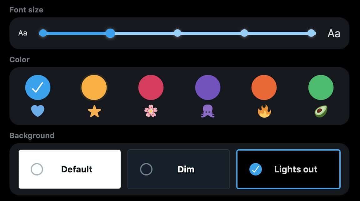
Allowing users to change to bigger typefaces, different colour schemes, higher contrast palettes or implement dark mode version of sites, as you can see in the screenshot from Twitter above, the user has much more control on making the site appear visually pleasing to them.
We should be making it easier for people to access the content on websites, not adding barriers, so allowing them to access it in a way that works visually better for them is important if they are to return again and again.
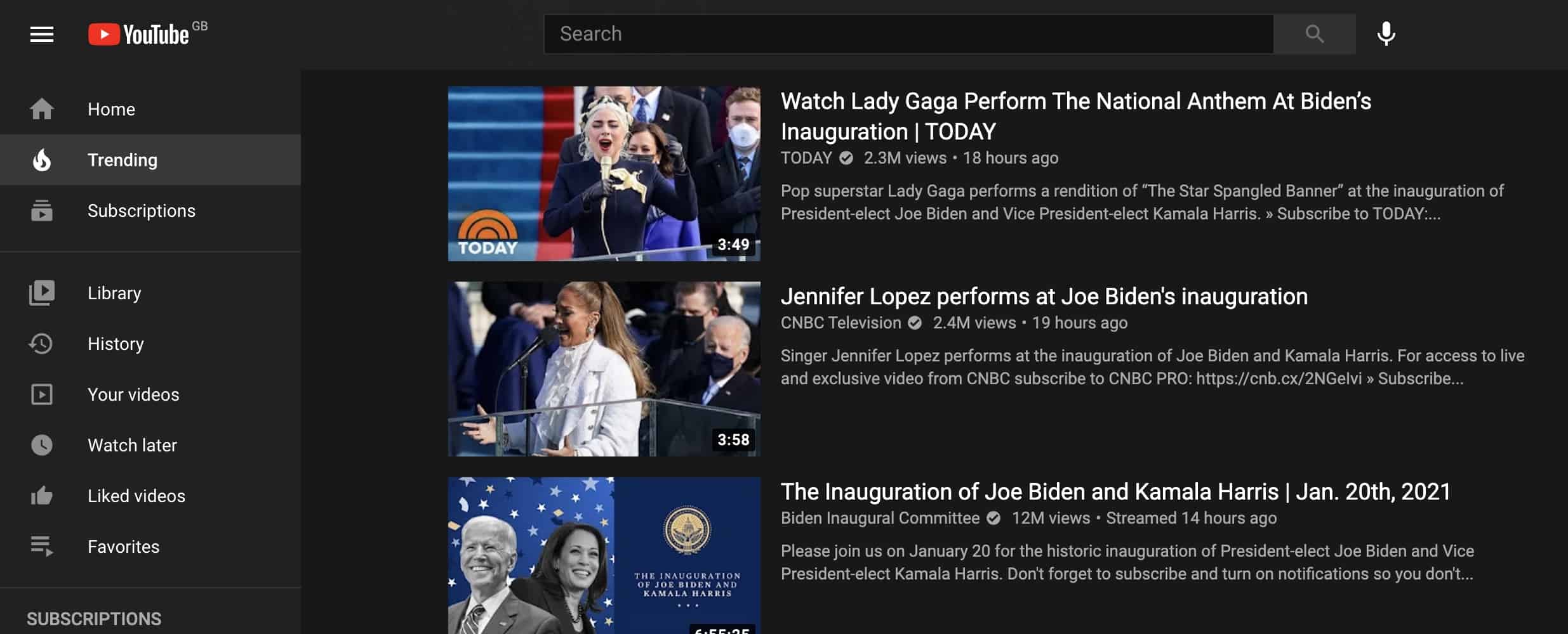
Dark mode, as you can see from the YouTube implementation below, is something that has really come into use across the board in 2020, with operating systems, apps and websites implementing the feature, Google stated it had been it’s most requested feature from users.
Of course there are many trends, colours and styles continuing to be popular from previous years – like use of illustrations and gradients, and we look forward to combining all of these to create some great user interface designs for our web projects this year.

If you’d like support in putting any of these into practice on a new project, or deciding what would work best for you, send us a message or give us a call.
Get in touch